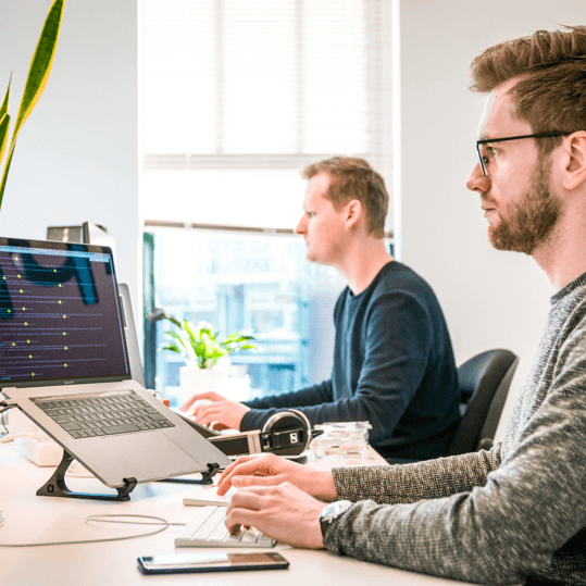
Thanks to digital developments and the constant demand of users for better experiences, website design trends are constantly in flux. While some trends are done and dusted almost as quickly as they first made an impression on the industry, others hang around and improve with time. In our capacity as a website design firm, we need to stay abreast of the next big website trends.
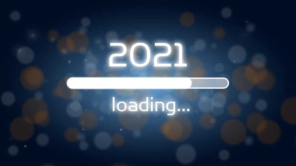
In the following post, we look ahead to the next year and what may be the key trends.
Smarter Content Loading
There are lots of websites out there, whether the owners are willing to own up to it or not, that is too heavy when it comes to third-party integrations, graphical elements, and images. All of which are responsible for slower load times than websites should have in this day and age.
Fortunately, there are ways around this so that you can have the sites you want with the visual content and integrations you need. One such way that we think will be used more and more in the coming year is what is known as “lazy loading”. Lazy loading has already been used by some websites in the last few years and works particularly well with one-page websites.
When you think that the fact many visitors to websites do not reach the very bottom, why would bother uploading all the unnecessary content and just add to the load time of the site? The best way would be to have the content load as your visitors scroll down through the page. With the lazy loading approach, the browser only downloads the content that’s necessary and on screen, not the stuff that isn’t.
Overlap Photography and Graphics
Another huge trend we are expecting to see in 2021 will be the overlap of photography with graphics. Using professional photographs is already a great way to give your website a good look and feel, but the addition of some killer graphics will show off your creative edge.
Some reasons why many web designers have started mixing photography and graphics include:
- Adds personality to web design
- Can be used to reinforce branding
- Creates depth and gives visitors more to engage with and stay on-site longer
Dark Mode
Dark mode has already become a big thing in web design, with many of the biggest brands and platforms out there offering this alternative colour scheme. Originally it was designed to combat eye-strain in low-light conditions and at night while helping reduce battery power usage. However, if you take a look at Apple, Facebook, Facebook, Twitter, Instagram, and even Microsoft products that utilize it, it helps to highlight and draw focus onto certain aspects of the design too.
Asymmetric Layouts
In the past, the majority of websites have been based around the grid layout. The reason this is popular because it is easy to provide structure for sites and allows the focus to be on crucial elements.
The problem is that sticking to this layout for websites limits how creative you can be. That is why a lot of web designers are looking for asymmetrical designs. It is the perfect chance for brands to avoid well-tread traditions and try more exciting and unique designs.
Although balance is needed, when your web designs stand out, it puts you head and shoulders above your rivals!